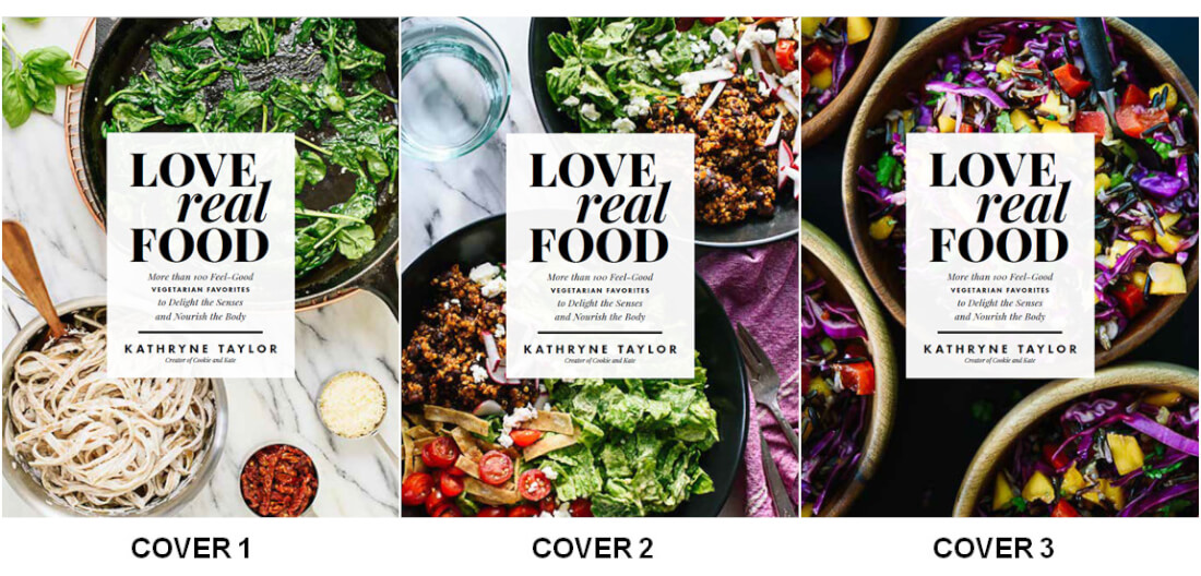
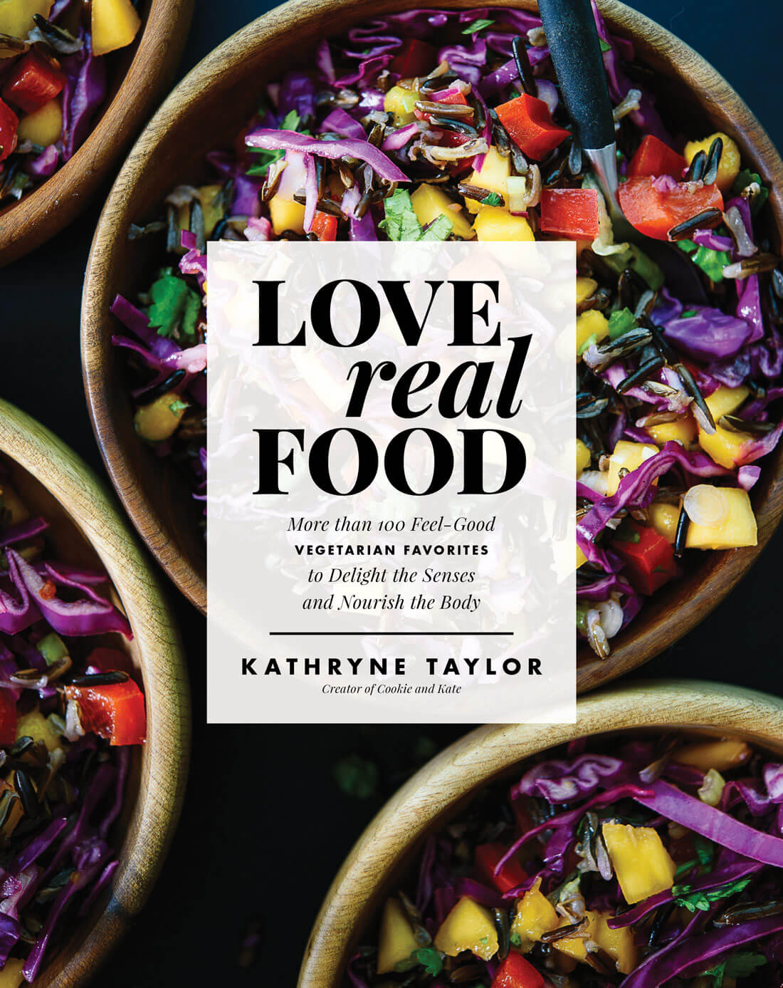
Help! I can’t decide on the cover for my new cookbook, Love Real Food. The book’s designer, Rae Ann, came up with three awesome options. I love them all, and I can’t decide which one should make the cut.
I proposed to my publisher that we let you guys pick the winner and they said yes! You all have been so supportive throughout the cookbook-making progress (thank you) and I’m thrilled that you get to pick the cover.
The book is officially available for pre-orders on Amazon and Barnes and Noble. I’m working on some final edits for the book now, and it’s so fun to see it all come together. I can’t wait for you all the see the book on May 16th!
Click through to see all three and vote for your favorite. Voting ends Wednesday, December 14 at noon CST!
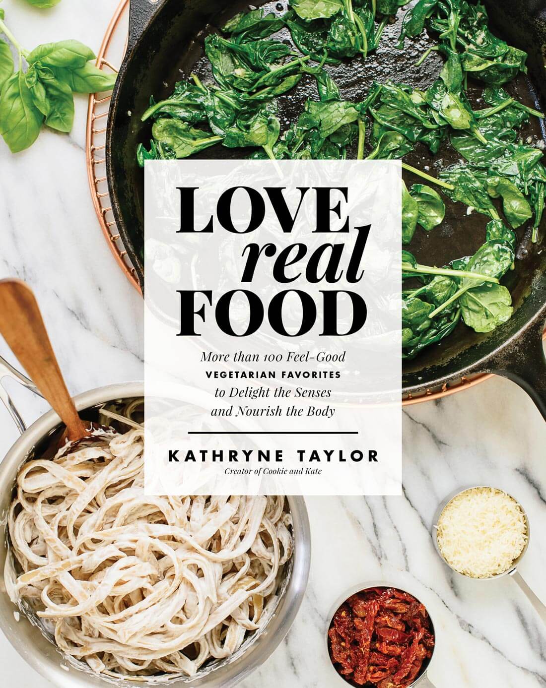
Cover 1
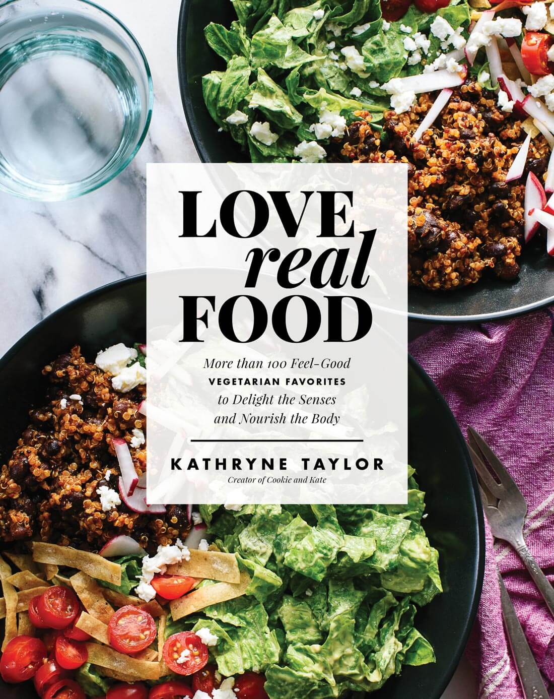
Cover 2
Cover 3
Sorry, voting has ended! Thank you all so much for your input.
FINAL RESULTS: 7445 Votes
Cover 1 – 949 Votes (12.8%)
Cover 2 – 3425 Votes (46.1%)
Cover 3 – 3058 Votes (41.1%)
I love cover number two! Thank you so much for your help.
 Vegetable enthusiast. Dog lover. I'm probably making a big mess in my Kansas City kitchen right now.
Cindi
#2
Sue
Cover 2
Melanie
This book cover vote is so fun! I love that you had your readers in mind to choose the cover.
The first one is a bit plain to me, though I’m sure the dish shown is delicious–it is a Cookie and Kate recipe, after all. Personally, I’d just be drawn more to a cookbook with a cover like the second one. Also, that cover easily squashes the silly idea that vegetarian food can’t be as yummy or appealing as non-vegetarian food. ;)
I am SO EXCITED for your book, Kate!
Leah
#2 draws my attention most. Lots of nice color and I want to take a closer look at what the dish is…then take a peek inside :)
Cat
#3. The darker background prompts readers to focus on the title “Love Real Food:
pamela
I voted for cover #3 because of the vibrant colors and the contrasting back background, which made everything pop (definitely needed once it’s in the bookstores and competing for everyone’s attention). Also, I like that it is a finished product. My second fave was #1 because of the modern, clean airiness. However, I wasn’t fond of the kind of limp looking spinach in the pan (great for an interior photo, just not outstanding enough for a cover photo). Also, it’s so pale and whitewashed, I fear it won’t pop when sitting with a bunch of other cookbooks. FYI: I was a prop-stylist for cookbooks/blogs, so hopefully my comments were helpful!
Aitana
I am NOT surprised you have a hard time choosing!! I love the first in the end because it feels like a complete and healthy meal as I know them. But quite frankly, you can’t go wrong with these… looking forward to the book!!
Jeannie
Number 2 is my favorite. I like the variety. It makes me want to open the book and begin looking for the recipes.
Marieke Van De Pieterman
Cover 2 looks beautiful, just the right balance of colour, and it makes me hungry & inspired looking at it!
Tenile
Love 2❤️️
M
It is hard to choose! I voted for the 1st one as I felt is was clean and balanced. I liked the 2nd one as well, but considering both, I felt that my first choice would be towards something more clear and with more light, despite loving the colour scheme of the other one as well. The 3rd one is also lovely but a bit heavy. Great Work! And thank you for asking for our vote :)
Joan
I love the color in #3. It makes the cover pop and would grab my attention!
Karri c
They are all awesome- but number 2 is what just catches my eye. Also- I think it should say Cookie & Kate somewhere because I don’t really know you by your real full name and I might just pass right by it
Lynne
I am so looking forward to your cookbook Kate :-) I voted for #1. To me it is clean, simple and really stands out. Huge congratulations on your book :-) x
Angela
They are all very appealing! Looking forward to this coming out!
kate
hey lady. i’m a huge fan of your blog (so is my husband and my mom). can I say i’m slightly underwhelmed by the three choices? you have such better pictures! not trying to be critical–I just want those cookbooks to fly off the shelves! are there any other options? either way it’s going to do great. you’re a talent!!
Parvati Grais
Hi. My vote is for #3. The colors against the black background make the title of the book pop out in variation #3 more than the others. It totally grabs my attention. The other variations are fine, but lack the ‘pop’ quality.
Karen
For me the first one seems cold because of too much white. I love the colors in the third one. That would make me want to pick it up. But I’m afraid the readers might think it was a book of salads. The second one has color but represents a whole meal. It gives you hope that this book will lead to delicious meals not just raw foods. All the best to you in your endeavors!
Samantha
2 or 3!!
Camille
All covers are beautiful, although I think #3 has the most pop, especially as a thumbnail. Congrats on the cookbook! I’ve been following your blog for several years and absolutely LOVE all your recipes. I’ll definitely be picking up several copies of your book. (For me and my friends!) Thanks for all the great recipes!
Kathy
Really liked them all but cover #1 gets my vote.
Sandy
Totally love the color combination on #3.
Kathryn
Voted…and pre-ordered!
Natasha
I voted for cover three. The colors grabbed me. I also like option two and agree with many other commenters about the balanced nature of the colors and the shapes. I am not a fan of cover 1. Sauteed greens never look good. Good for you sure, but not visually stunning like the food featured on the other two options. Good luck and cannot wait for your book!
Maureen
Love #2
Best design visually
Rae
All three are beautiful but cover 2 displays the potentially diverse dishes that can be created.
Karen Lewandowski
Number 2 makes me want to know more. What is that all she’s got in there. Which ever you pick I’m buying it!
Hana
I really love cover 3 because the purple contrasts so nicely with the textbox, and also the whole point of the book is to show how good, wholesome food can be interesting and varied which I think the purple conveys really well. (Btw I was so thrilled to hear you on the A Couple Cooks podcast! I’m a huge fan of theirs and it was lovely to hear your voices all together)
Nicole
The colors in number 2 are beautiful. All of the covers are lovely, but I chose number 2 because of the variety of color and foods. I feel that 3 shows too much of one dish, and 1 is not as exciting. 2 shows the potential for what we’ll find when we open the cover.
Melissa Durham
picked number 1- Clean, uncluttered look. Allows you to take in the ingredients, creates a sense of wonder of what will become of the process unfolding. Also, allows one to take in the cool cooking elements, the rose gold hot plate, cast iron skillet, wood spoon, etc.
Number 2- looks like meat at first glance.
Number 3- great color contrast but i feel like red cabbage is likely an unappealing ingredient to most new vegetarians paired with mango- probably too far out there initially.
Cant wait to pick up multiple books for friends and family. We pretty much exclusively cook your food and cook 4+ times per week. Thanks for changing our lives Kate!! : )
Nancy.desroches
I pick 2 for your new cook book I think it best represents you Looks pleasing to the eye Colourful! Tried many of your recipes over the past year plus I love dogs
Heather
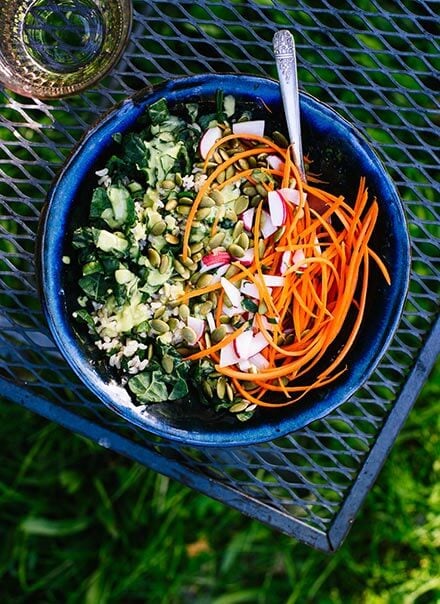
I just voted for number 2. The only thing I don’t like about the cover is the glass of water. My MIL was asking if there were any cookbooks I wanted for Christmas/Birthday (we’re birthday twins!) and I told her your book! I’ll let her know it’s available for pre-order : )
Patricia
All of the covers look amazing! I love the colors and they make me want to dive right into those pages and start cooking. I’m excited for May!
Anick Lambert
more colours and diversified. I also asked my husband and he chose the same.
Stephie3Cats
I voted for 3 because the colours of the purple and the green really pop and the whole darker background makes the white book title stand out
Denise Miller
Just pre-ordered your book! I am so excited for you and all of us!
I voted for #2. Loved the colors.
Stacey
I voted for #3 because a big part of eating whole foods is eating lots of different colors. “Eat the rainbow!” What’s more vibrant and beautiful than bright purple cabbage? Gorgeous!
Marsha McDonough
I picked #2 because it more accurately represents the richness, textures, and flavors of your cuisine and style of cooking.
Maria Bija
Cover #2 is the most balanced in composition. #1 feels too light/white on one half, and #3 is a bit too dark. I hope #2 wins, but either way I can’t wait to order it! Your recipes continue to be some of my family’s favorite dinners.
Heather McClees
Gosh! That is a hard choice!!! It took me several minutes to decide, but I am so excited about your book!!! I chose number 3 after lots of thinking, mostly for the color scheme and because the bowls add just the right touch. But they are all great! Number 1 would be my second choice because it looks so clean, and an “undone” dish is kind of refreshing. Can’t wait to buy it!
Debra
I love the look of the color variety
Julia
I voted for number 2 as well! Although I love the simplicity of number 1! I like all the colors and food in number 2.
Robin
These will be my Secret Santa gift to a co-worker with a sweet tooth & a taste for quality ingredients!
Thank you for a quick fix to my dilemma! :)
Christie
Love cover #1, the heavy cast iron with spinach ever so perfectly wilted. . . now that is a pleasurable moment in cooking!
Wanted to let you know, that I am eagerly awaiting your cookbook, but can’t do a preorder since we will most likely move before May (preorders ship to current address). I have a google tickler reminder to buy on your release date on May16th: ) <3
Marie
Cover 3
Sarah
I totally agree with grace. I like cover 3 and think those colors stand out. But I think she is right, you should lower the opacity of the white paragraph with the title. I think if the white box was more translucent, that would look better on all cover options.
Jodi
It was a tough decision between #2 and #3 but I went with #3 because the colors and food looked so appealing. My eye went to it first and I think if I saw that cover at a book store I would pick it up. Just beautiful colors and textures overall but #3 looks so nurturing.I also like the textured look the bowl circles create. What a wonderful accomplishment. You should be very proud. Can not wait to buy the book!
Leslie
SO excited to explore this cookbook and start some more adventures in the kitchen. You helped me change my eating habits over 2 years ago during my sophomore year of college, and now I can appreciate healthy food and cooking in a way I never knew how to before. Love cover number 3! <3
Helen
Hi
I love cover number two its bright ,colourful and interesting hope this one win for you Kate.
Asa
The most inspiring and colourful. It also catches the eye and purple makes you happy.
Kathryn
Cover one is too white and top heavy, not appealing, cover two also has too much white space with the water taking up space but uninteresting, cover three is very colourful and attractive.Cheers!
Hannah F
Cover #2 for the win!!!! I thought the same exact thing as other comments, so it’s no need to be redundant! Lol. Visually, #2 was the best, although it was a toss up between #2 and 3. Number 3 would have won for me if the background was lighter.
Ana
I chose cover 1 because it had a clean graphic look and also felt like ‘real food’ ingredients, defining the title. It had a more Donna Hay feel which I love. Cover 2 is my second choice, but I didn’t choose it because it had undefinable already prepared food items (looked delicious, though!) that didn’t say ‘real food’ as much to me.
The greens in cover 1 looked so yummy I wanted to eat my screen!
Whatever cover you choose, the contents will be amazing–of this I’m sure. : ) Best of luck!!
Juliana
Cookie and Kate – love you both! And have so much admiration for you, Kate Just voted for Cover 3. The very best to you for your book!! Happy holidays and a delightfully creative, healthy, and vibrant 2017! Juliana
Mariann Kovacs
Although the other two options are more colorful I voted for cover 1 for it’s no-nonsensical purety and freshness – for me it lives up to the title best. Xxx
Nazia
I think the 2nd one is better as your cover pic.Because its colourful and aslo clear.In 1st one,it is too simple to select it.If we see the 3rd one,it is not so clear and too much colourful looking where the theme of the book is not reflected.Please choose the 2nd one.It reflects the theme,food textures,recepies which this book describes.Best of luck for your book.Thank you.
Heather
I voted for Cover 3 instead of Cover 2 because there’s no confusion about it being a vegetarian cookbook. Especially with the purple cabbage. It’s still colorful but without a “meaty” appearance. Regardless, I’m looking forward to seeing the recipes!
Cassie
All of these covers are beautiful :) I know that the cover was chosen already, but I just wanted to let you know!